FINFLXUX/UI Design
Overview
FinFlx specializes in extending financial services to small and medium enterprises (SMEs) while ensuring adherence to regional labor regulations. To bolster its growth endeavors, the company has introduced a fintech mobile application designed to enhance the economic wellness of the SME workforce it caters to. This application presents a smooth and user-friendly interface, encompassing features such as financial forecasting, budgeting aids, effortless account administration, robust security elements, and instantaneous notifications, all aimed at assisting users in effectively managing their financial matters.
Problem
FinFlx's objective involved broadening its range of financial services targeted at SMEs. This entailed the launch of a mobile banking application tailored for their staff, with the ultimate aim of enlisting 30,000 in-house users (B2B2C model) by the conclusion of 2024. However, the initial UX/UI concepts and design for the application did not align with the well-established brand identity. Additionally, these designs fell short of adhering to accessibility guidelines and fundamental principles of heuristic design. This predicament carries the potential to adversely affect the user experience, consequently impeding the successful adoption and utilization of the application.
Solution
Our team put forth a redesign of the user flows for the investment features within the FinFlx mobile banking app. The updated design incorporates user-friendly interfaces that are easy to understand, simplified navigation, and improved visual components. The outcome is a design that harmonizes with FinFlx's brand identity and accessibility standards, ultimately yielding a captivating and effective mobile banking encounter for users.



Discovery
Kickoff Meeting
The team met on Slack to discuss the requirements and demands of the client. We carefully went through the stored Google Docs records containing detailed information about the application. Moreover, the team conducted a comprehensive analysis of the Figma file, which covered the user flow, style guide, and other vital components necessary for successfully finishing this project.
Observations:
• The intended audience are employees of SMEs who are presently utilizing FinFlx's HR management web application.
• Desired traits of the application encompass attributes such as security, trustworthiness, reliability, transparency, confidence, and a sense of safety.
• In terms of redesigning, our goals encompass achieving uniformity in visual and font hierarchy, maintaining a harmonious equilibrium between textual content and graphical elements, and ensuring that the overall content remains clear and straightforward.
• The primary user journey involves investing their money.
• Prominent competitors in the field include Sarwa, Stashaway, Aurem and Equevu.
Competitor Research
We carried out an in-depth analysis of our competitors to gain deeper insights into prevailing market trends and user expectations. This was essential to empower us in making well-informed design choices that would result in the creation of a distinctive mobile app tailored to the specific financial services market we were targeting.
My primary focus during this analysis encompassed a comprehensive examination of the user interface and the arrangement of information.
The key takeaways:
Clear and legible CTA's are important
A clear intention and mission need to be visible
Easy navigation is key for good user-experience
Type has to have enough contrast
Images are helpful to show where you are in the process of the service you are trying to use
Redesign
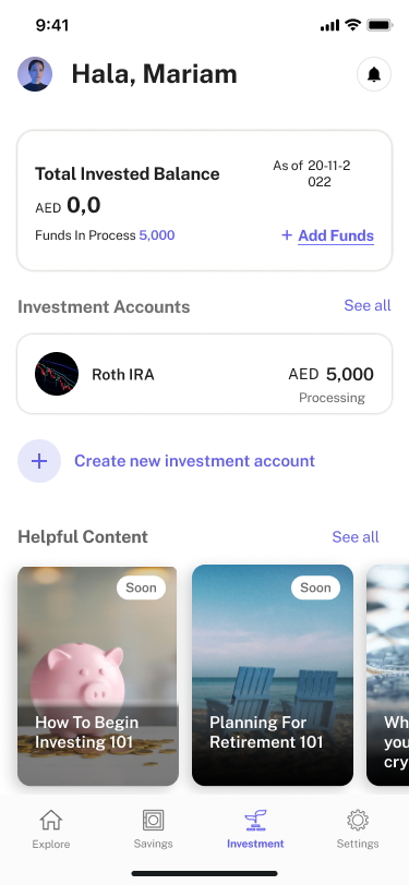
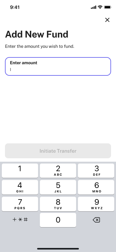
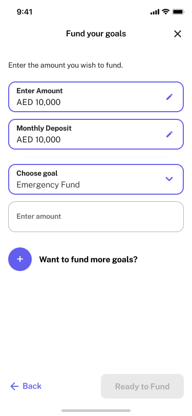
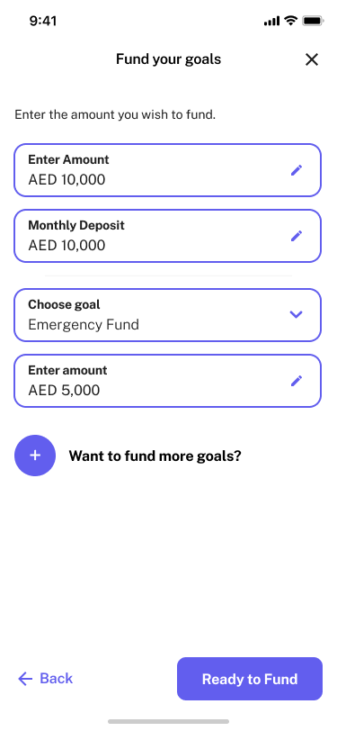
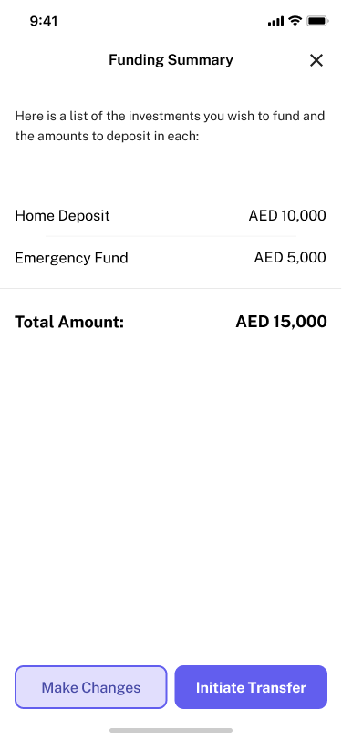
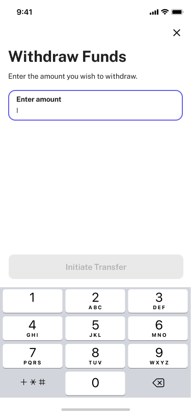
I focused on multiple flows that included withdrawing, transferring, and adding funds and accessing the investment homepage to enhance the design's uniformity, all the while ensuring it remained aligned with the screens being developed by my team. I sought opportunities to elevate the visual excellence of the screens, all within the parameters of the style guide established by teams in previous phases.
CHANGE #1
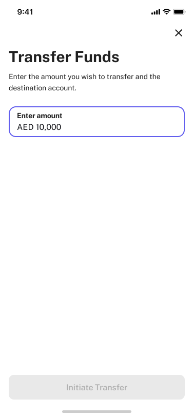
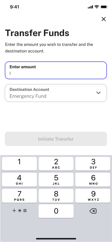
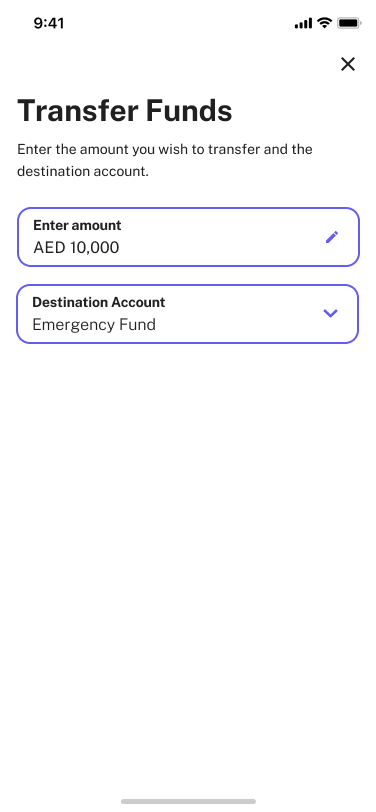
Improved system visibility:
By highlighting distinctions between active and non-active text fields the redesign has an elevated the user experience in the following manners:
• Enhanced efficiency: The additional transfer detail information enhances the transparency and effectiveness of the fund transfer procedure.
• Decreased errors: The differentiation between active and inactive states minimizes user confusion and data entry mistakes.
CHANGE #2
Incorporating information cards:
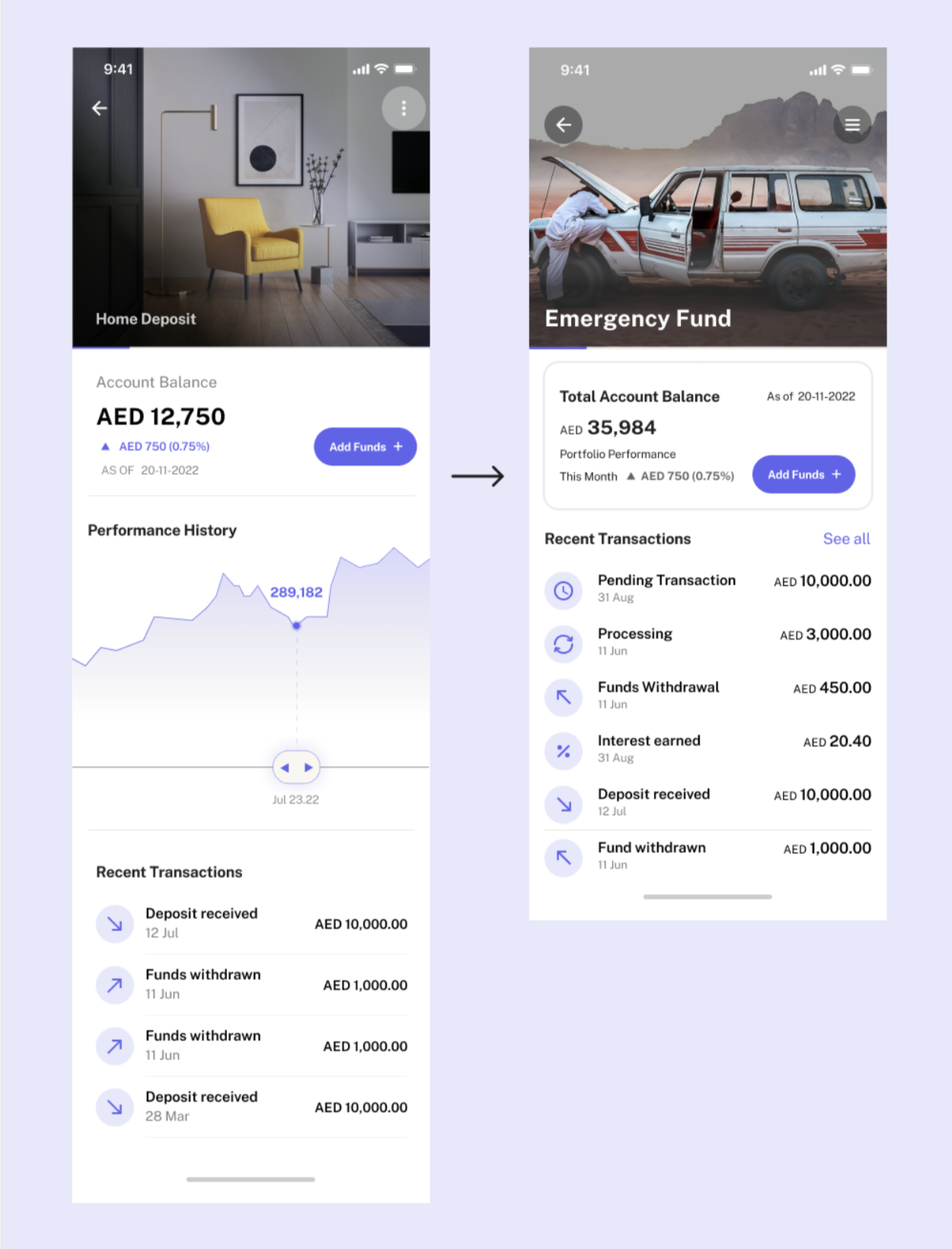
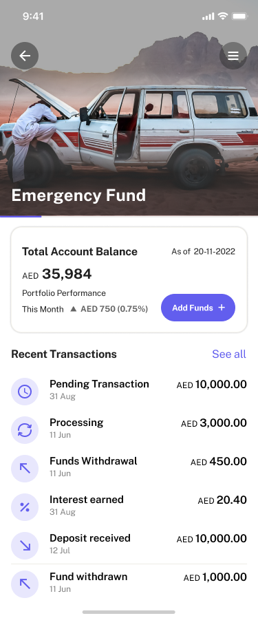
Showing the account information and getting rid of the graph that was hard to read on the Investments Home Page, the redesign enriched usability in the following manners:
• Reduced Cognitive Load: The provision of distinct account information options simplifies users' access to their desired information, thus minimizing cognitive strain.
• Diminished Confusion: The use of numbers rather than a visual graph to show performance history diminishes the confusion of the information presented.
• Heightened Engagement: Through the ability to see your account balance information, ability to add funds, and see all recent transactions users are encouraged to check their investment goals more frequently.
• Enhanced Visual Appeal: The incorporation of cards to show account balance information looks more polished and professional. The addition of circles behind the icons at the top card also helps with visibility and an easier user-friendly physical experience.
CHANGE #3
Enhanced visual appeal of the interface:
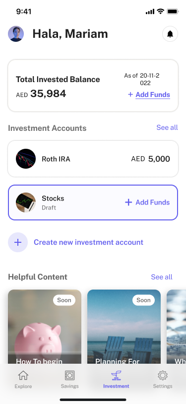
Accentuating the hue of purple within the redesigns such as the selection of a goal or account, underscores the brand's overarching style, promoting a more polished look. The ability to use a color that stands out when an item is selected makes the design more user-friendly.
CHANGE #4
Enhanced Information Structure while Maintaining User Autonomy:
By offering users well-defined and succinct labels and guidance, their sense of control and self-assurance in accomplishing tasks can be significantly bolstered.
The primary alteration in these displays resulted from maintaining consistent typography, enhancing the clarity of information presentation. Additionally, adjusting the size of the CTA button reduces interface congestion, creating a more user-friendly and intuitive experience.
Style Guide
We created the style guide using the client's brand colors and fonts. We included icons that were necessary for an accessible user experience and components to facilitate easy editing and replacement of important assets by future designers. I created components for the cards and CTA's to help the consistency in designs throughout the screens. We also made sure that all icons that were on top of an image had a transparent circle on the back to help the visibility of icons in all instances. The style guide was instrumental in creating a consistent design language for branding and was carried forward to our high-fidelity screens.
Hi-Fidelity Screens
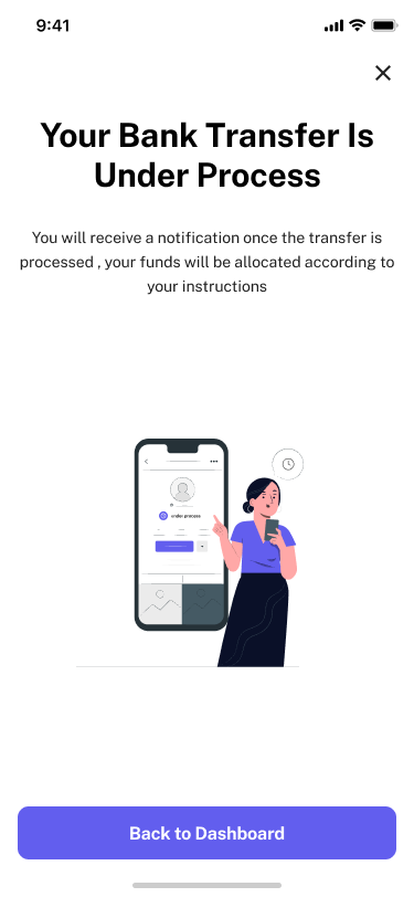
Developing our high-fidelity screens involved my contribution to augmenting the user experience through the incorporation of consistency within typography and visual elements. This effort led to the refinement of user flows and the enhancement of information architecture. I specifically worked on the screens below which encompassed withdrawing funds, transferring funds to different accounts within the app, transferring money to the users bank, and being able to access the investment dashboard with all transaction history visible. Collaboratively, we generated many seamless high-fidelity screens by incorporating client input.
The only changes that were made after talking to the client were the adjustment of pages that had 2 CTA'S at the bottom. Instead of stacking them on top of each other, I made them half the size and laid them out beside one another to minimize user error when selecting the desired outcome. This also helped the page look cleaner and more polished.
Developer Handoff
In order to establish transparent communication among our team, the client, and the developers, I marked the screens I worked on with precise component-to-component distance measurements and comprehensively recorded all pertinent details. I made sure to specify what the user journey would look like in detail through text and arrows. Our objective was to furnish a comprehensive grasp of the design journey and diminish any potential for misunderstandings or communication lapses.
Reflection
Reflecting on the Past
I'm deeply appreciative of the ability to collaborate and work on this thrilling fintech startup. Here are some of the key insights I've gained:
• Meticulousness is of paramount importance: The finer elements, including microcopies and color selections, wield considerable influence over the overall user encounter with FinFlx. Diligently tending to these nuances is integral to crafting a visually harmonious and impactful design.
• Embrace iteration: The design journey is a continuous cycle, demanding constant reflection on feedback and subsequent refinement.
• Adaptability is crucial: Unforeseen modifications aimed at enhancing user experience can arise unexpectedly. Being flexible enough to adjust to shifting requirements and limitations is vital to deliver an optimal end product.
• Collaboration is the linchpin: Effective teamwork among designers, developers, and stakeholders is imperative to ensure universal comprehension of the FinFlx project's objectives and the seamless flow of its development.
I found immense satisfaction in collaborating with an existing design system that was ripe for a redesign and implementation, as opposed to commencing from the ground up. The allure of refining an established design system encapsulates the essence of the design process—a continuous cycle of enhancement. Crafting and iteratively refining creations stand as the cornerstone of triumphant design endeavors.
Looking Ahead
I'm enthusiastic about the prospect of FinFlx and expanding the boundaries of what's achievable within the Fintech world. The most beneficial way of going forward is to pioneer cutting-edge technologies and trends. Perpetually explore novel prospects for harnessing emerging technologies like machine learning and AI to elevate user experiences and remain at the vanguard of innovation.
I'm enthusiastic about collaborating on refining and revitalizing current design systems. I firmly believe that the essence of effective design and the design process lies in the continual evaluation and refinement of elements, leading to an improved user experience. I look forward to working on projects like this in the future.


