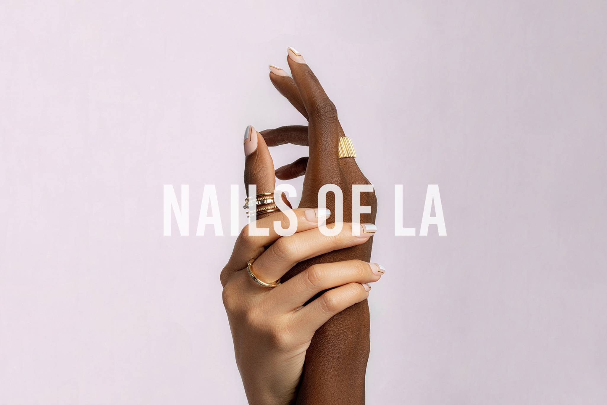
NAILS OF LAVisual Identity, Print and Digital Design
Nails of LA is a celebration of modern aesthetic and design, where the seemingly simplest lines and cleanest curves come together to create unexpectedly intricate masterpieces.
The branding for Nails of LA is defined by the words "feminine" and "bold." Soft and inviting colors like pinks and purples are balanced with a punch of bright peach, introducing a boldness that brings the brand into the modern world. The logo utilizes Futura, a modern, minimal font that exudes a confident and bold tone.
With the branding clearly established, the digital design phase took shape, incorporating beautiful imagery of hands and nail art as the main focal points. The colors chosen accentuate the tone of the brand, creating a cohesive and visually striking digital presence. The digital design suite includes the website and social media posts for the launch. As new collections are introduced, fresh imagery and colors are seamlessly integrated into the website, ensuring it remains dynamic and up-to-date.
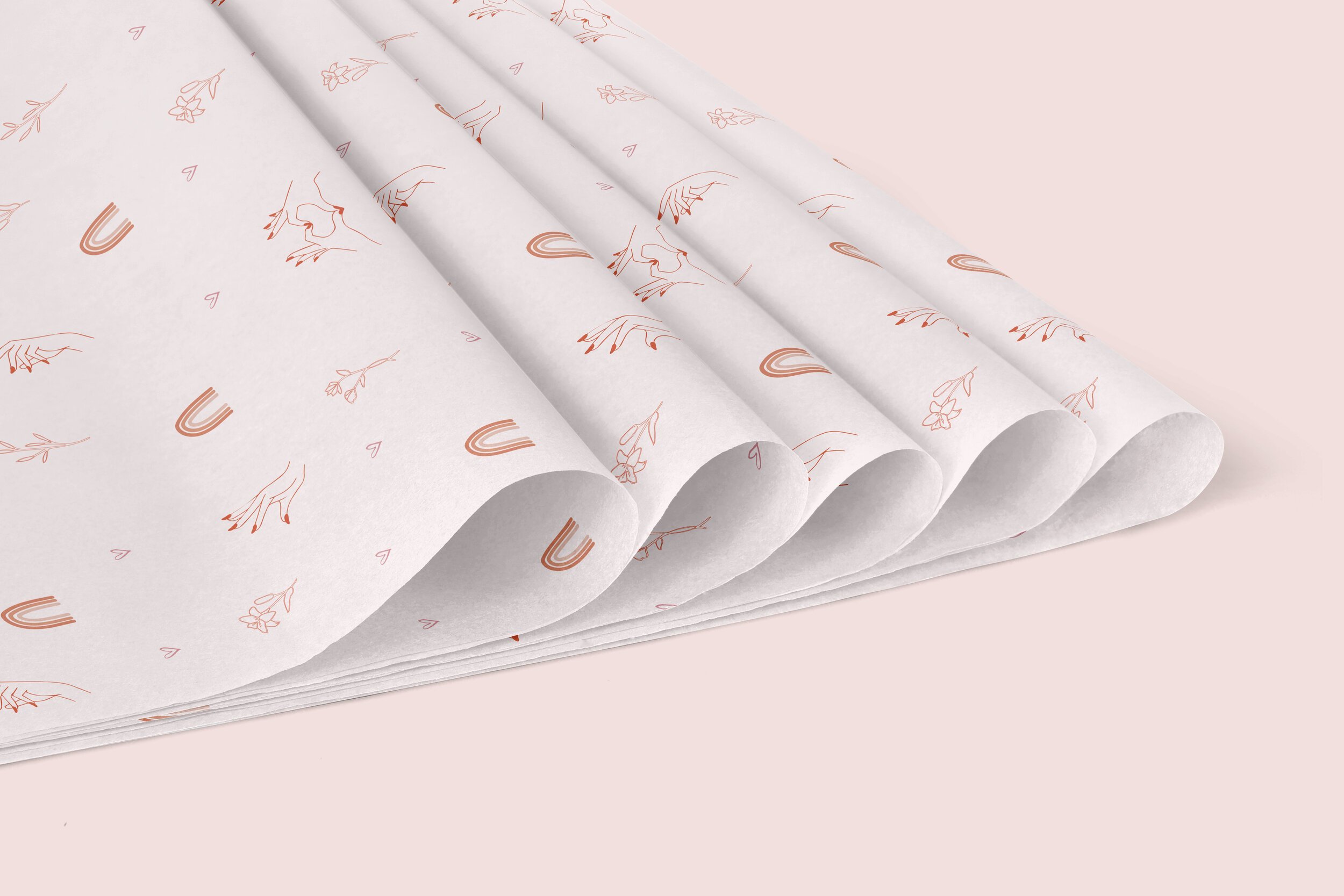
The print design phase was equally meticulous, featuring mailer boxes, postcards, and tissue paper that were mailed out to enhance brand awareness and provide educational materials. These printed elements were designed to extend the Nails of LA experience beyond the digital realm, creating tangible touchpoints that resonate with the brand’s aesthetic.
Overall, the project for Nails of LA not only established a strong and cohesive brand identity but also created a seamless bridge between the physical and digital customer experiences. Every touchpoint, from the website to the mailers, reflects the brand's ethos of modernity, sophistication, and bold femininity, ensuring that Nails of LA stands out in the competitive beauty industry.
Location: Los Angeles, California
Visual Identity and Design: Stephanie Schiller


