orlyBUILDER IN A BOTTLE
Visual Identity, Packaging, Print and Digital Design
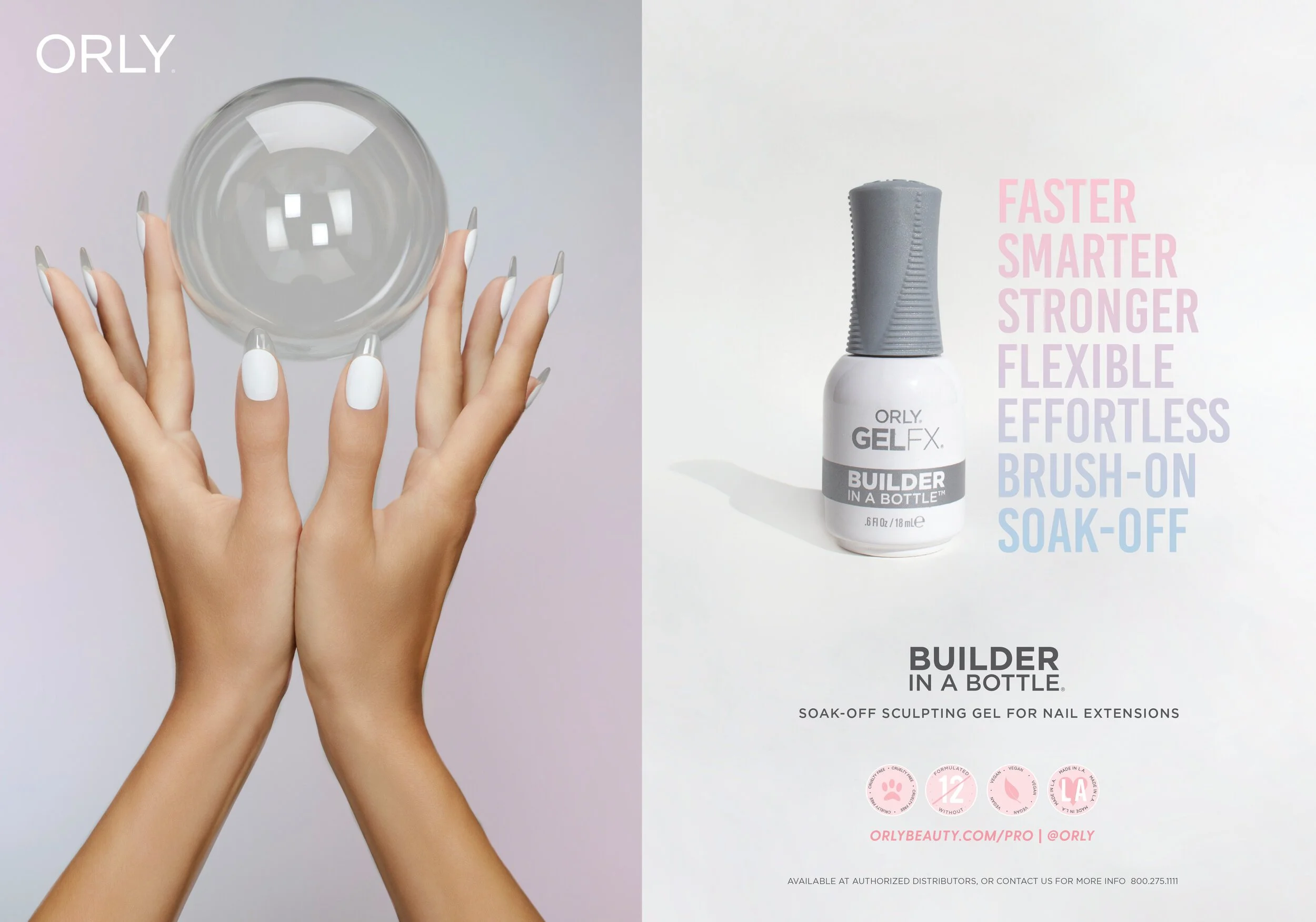
The art direction for Builder in a Bottle embraced ethereal cotton candy clouds, using soft pinks and blues to create the dreamy glass nails that every client desires. This whimsical yet sophisticated palette was carried through all elements of the branding and packaging, ensuring a cohesive and eye-catching presentation.
Packaging design encompassed boxes, bottles, and pamphlets, maintaining a consistent theme of white and gray accented by spotlight colors of blue and pink. This color scheme not only made the packaging stand out but also reinforced the ethereal and dreamy aesthetic central to the brand.
Print design was a crucial component of the project, including posters for in-store use and advertisements in prominent beauty magazines such as Nails Magazine. These print materials were designed to captivate and inform, effectively communicating the benefits and unique qualities of Builder in a Bottle to a wide audience.
The launch campaign included a comprehensive suite of digital assets. Emails, social media posts, ad banners, and eCommerce assets were meticulously designed to align with the brand’s visual identity. The digital launch strategy ensured maximum reach and engagement, showcasing the product’s innovative features and beautiful results.
In summary, the Builder in a Bottle project not only established a robust and appealing brand identity but also created a seamless and engaging customer experience across both physical and digital platforms. The ethereal art direction, combined with consistent packaging and compelling print and digital designs, positioned Builder in a Bottle as a must-have product in the nail extension market.
Location: Los Angeles, California
Visual Identity and Design: Stephanie Schiller


