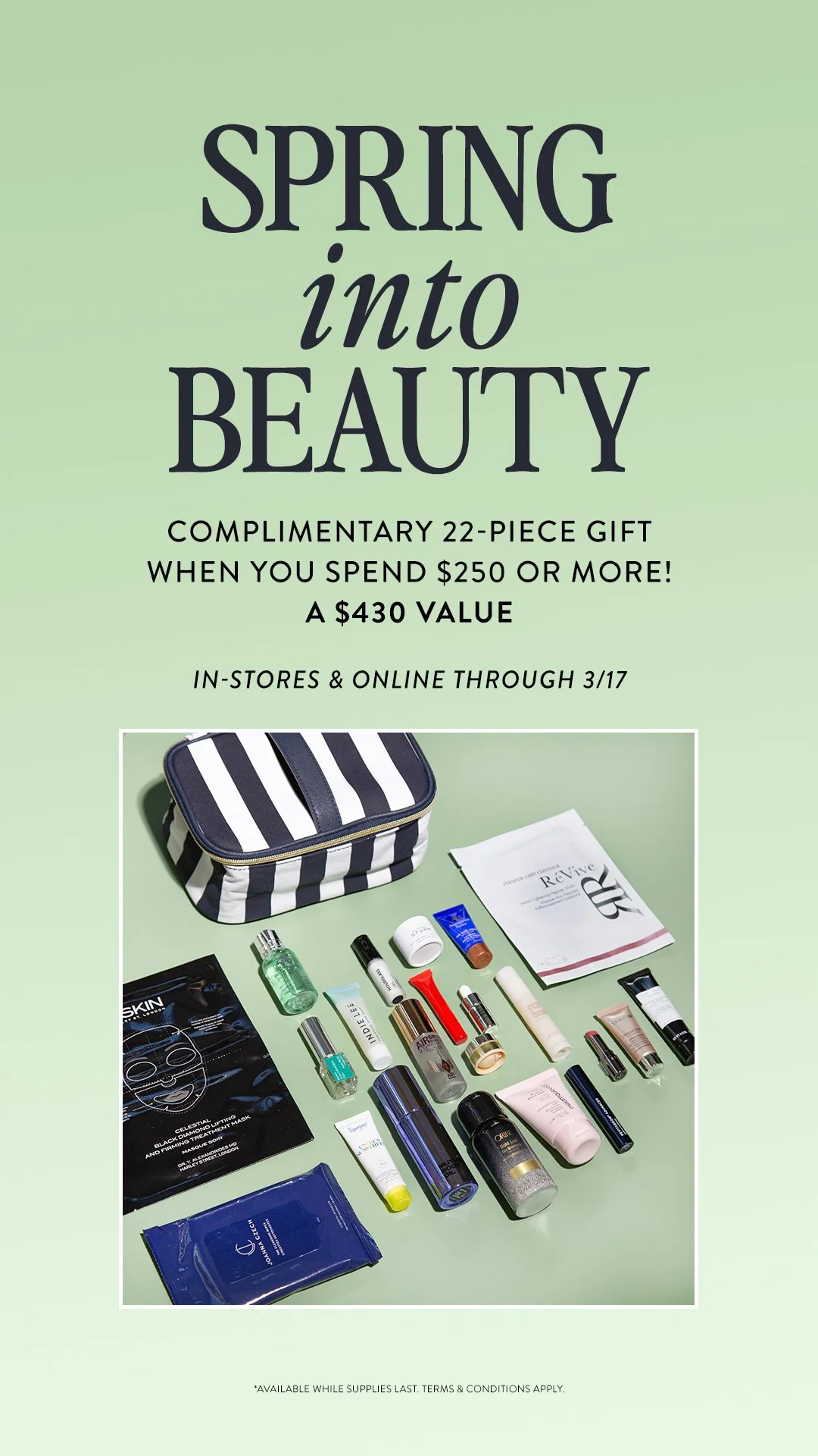
cos bar SPRING INTO BEAUTYArt Direction, Print and Digital design
Cos Bar is a premier luxury beauty retailer renowned for its curated selection of high-end skincare, makeup, and fragrance products. Established in 1976, Cos Bar has built a reputation for offering an unparalleled shopping experience, featuring top-tier brands and personalized beauty consultations. With a commitment to quality and customer service, Cos Bar provides an exclusive and sophisticated environment where beauty enthusiasts can discover the latest trends and timeless classics. Each store reflects a dedication to excellence, making Cos Bar a trusted destination for those seeking the best in beauty.
Luxurious, curated, and sophisticated—these three words embody the essence of Cos Bar. The retailer offers a wealth of expertise and reliability to its consumers. Cos Bar's "Spring Into Beauty" promotion celebrates the season with exclusive offers on luxury skincare, makeup, and fragrance products. It's the perfect opportunity to refresh your beauty routine with top-tier brands and discover new favorites. This project steers away from flashy marketing colors and typography, focusing instead on embodying the brand as a clean and reliable place to purchase beauty favorites.
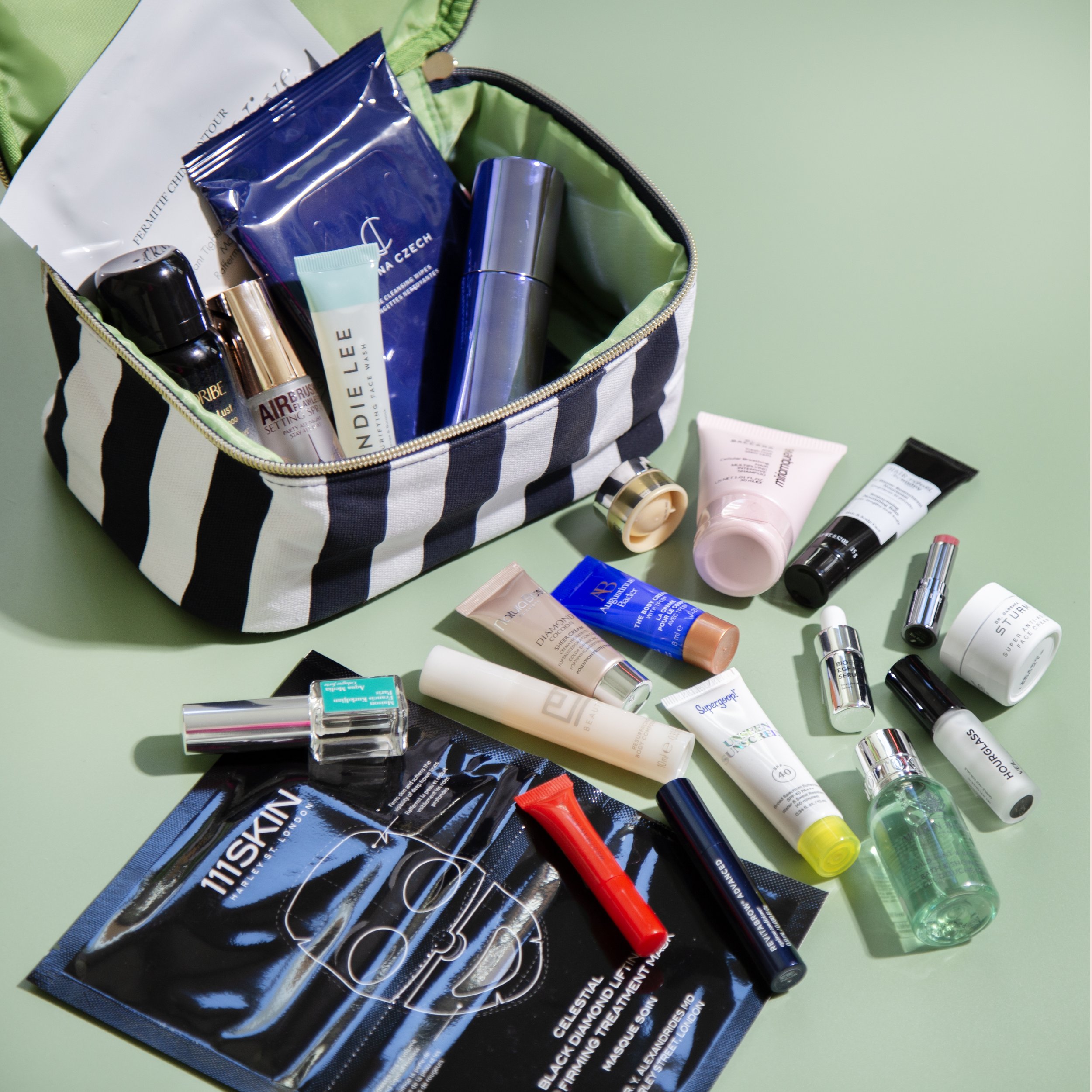
The creamy matcha green color used throughout the promotion nods to the season and the inner color of the classic blue and white striped bag. This bag features a surprise interior that stands out for its uniqueness. The products inside are a carefully curated selection of the best beauty products in the industry, showcased through glossy, simple, and clean photography.
It was a priority for the bag and products to be the focal point, ensuring they were the first thing consumers saw and clearly identified. The quality of brands and the quantity of products were the selling points of this promotion, making them crucial aspects of the visuals. Complementing the glossy, high-contrast photography, a clean serif font with an elegant italic counterpart was chosen for the typography. This sophisticated yet elevated typeface, mixed with the brand fonts, was used for primary typography across print and digital designs.
This project encompassed photography, print design showcased in all 21 store locations across the US, and a variety of digital assets, including emails, web placements, and social media content.
Location: Los Angeles, California
Photography and Art Direction: Stephanie Schiller


