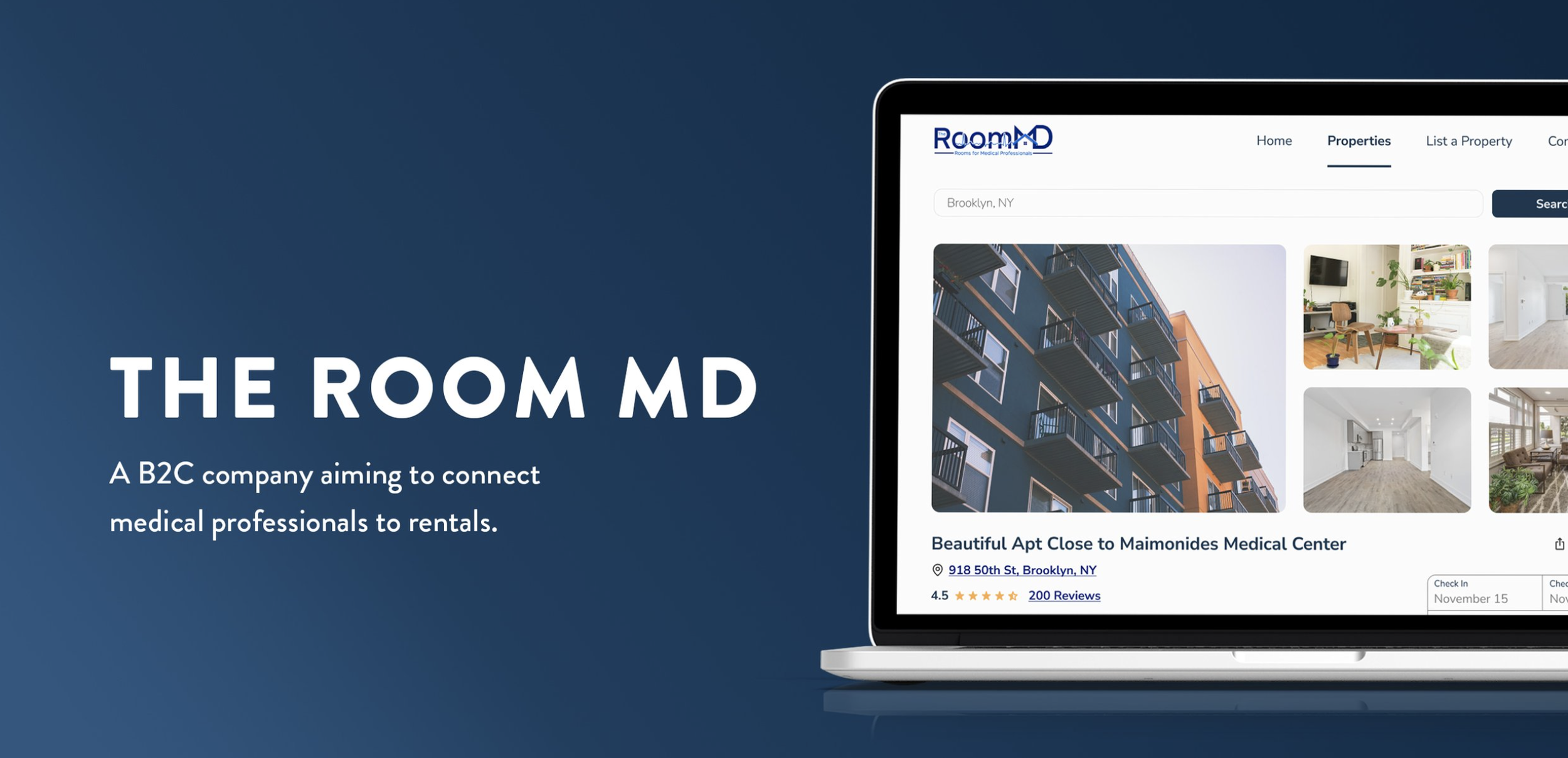
THE ROOM MDUX/UI Design
Overview
The Room MD offers to house medical professionals such as travel nurses and medical residents. They have a focus on company-owned properties but want to expand and allow other property owners to list their properties on the site.
Problem
Finding suitable housing can be an arduous process for medical professionals, such as travel nurses, as they often need temporary housing in unfamiliar locations. The process is made even more complex by the lack of a centralized platform or all-in-one product to help navigate the many options and requirements for short-term rentals.
Solution
The pages created on the website were designed to create a visually pleasing website that provides medical professionals with the tools they need to use The Room MD to its fullest potential.
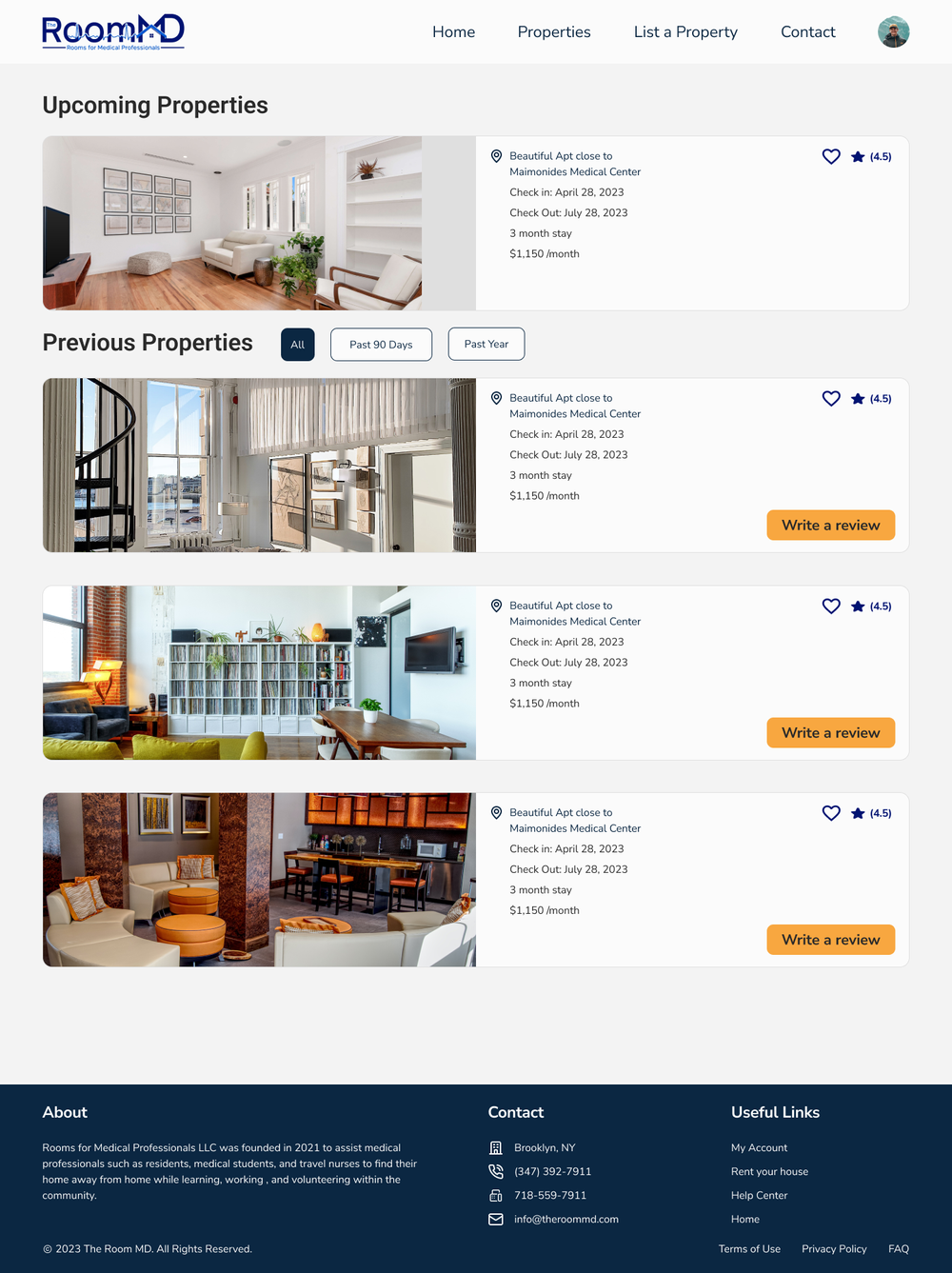
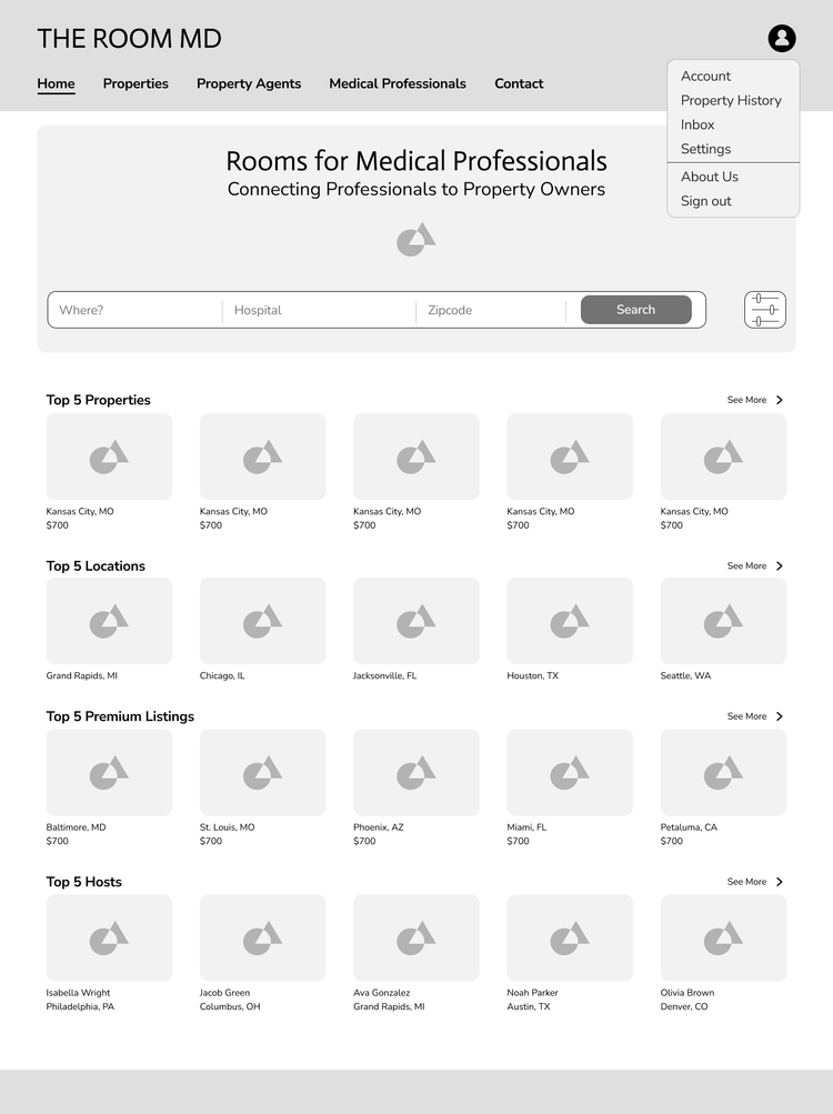
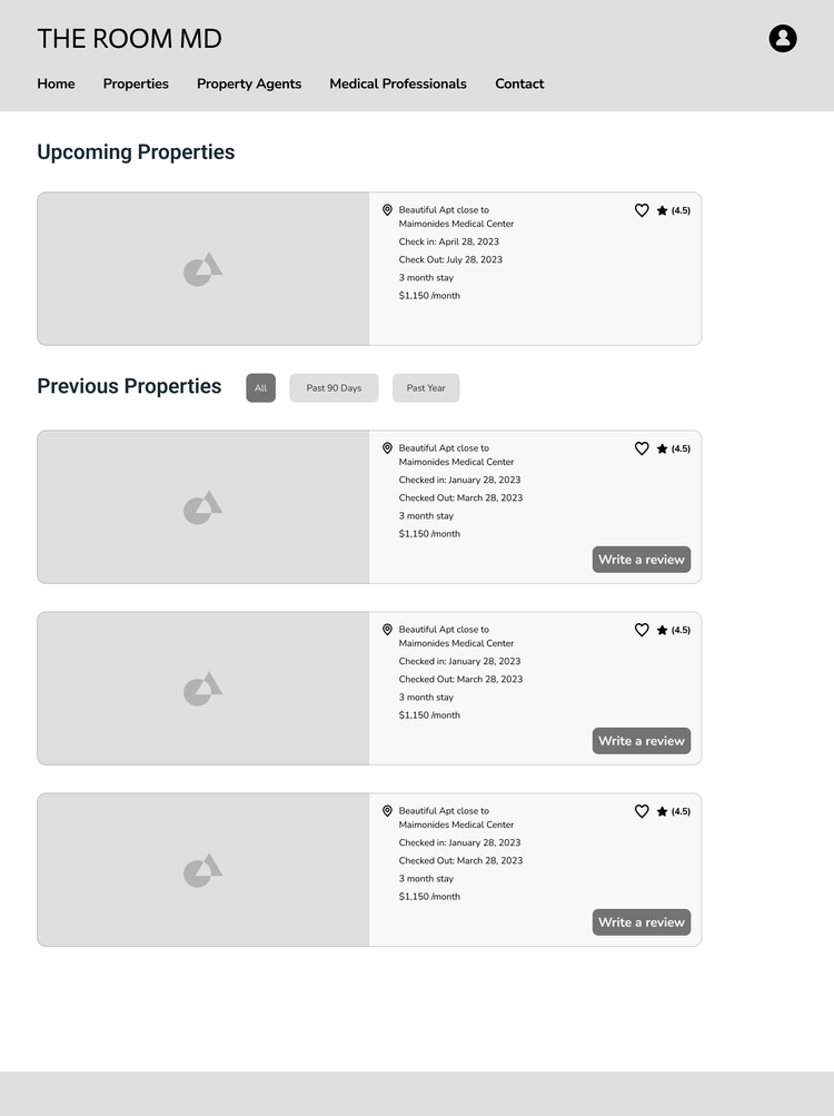
The dashboard Page was created to be a place where the user can look at their favorite properties, property history, reviews, and messages.
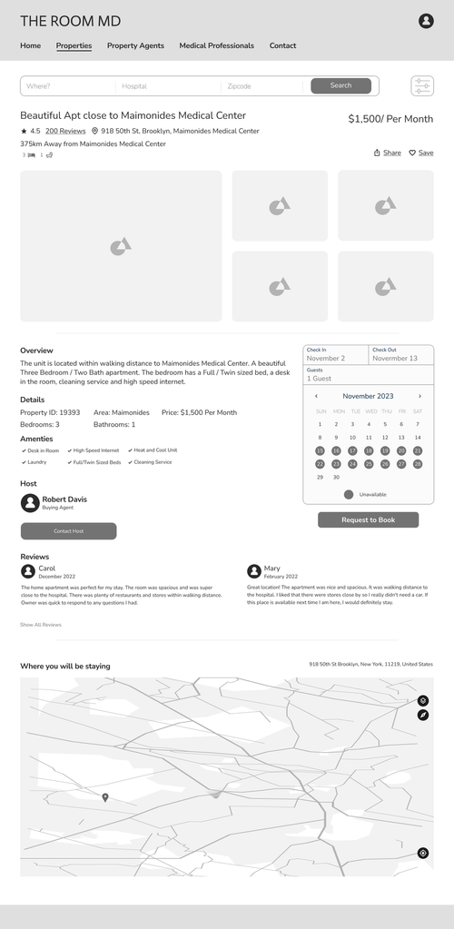
The booking page was created with a straightforward, user-friendly interface that lets users book without hesitation.
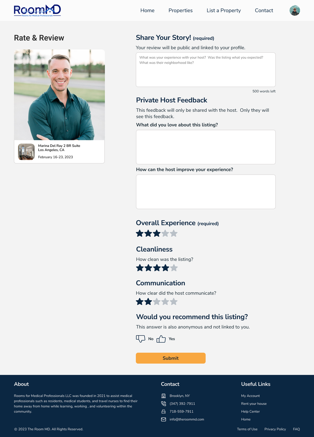
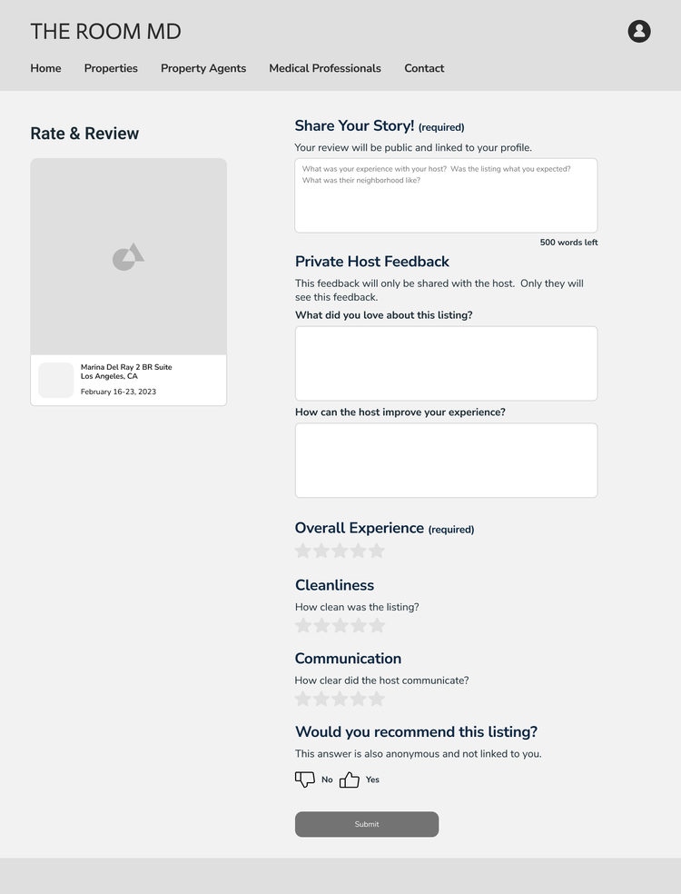
The ability to leave reviews on properties was added to create a sense of community and help professionals choose their housing.
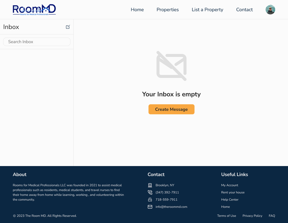
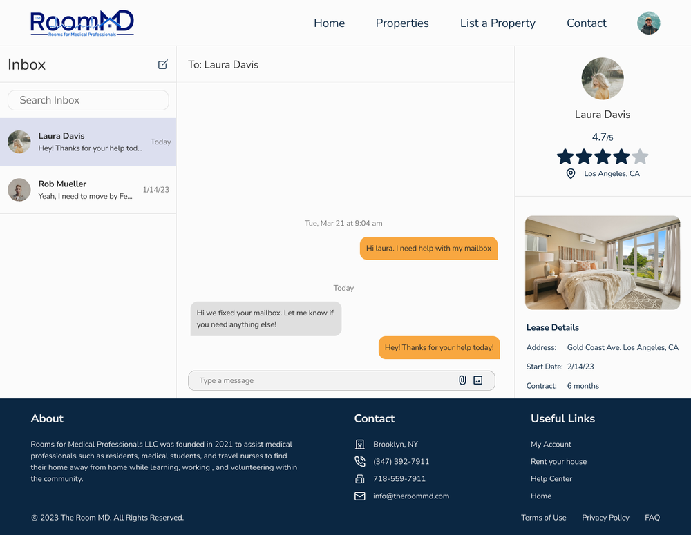
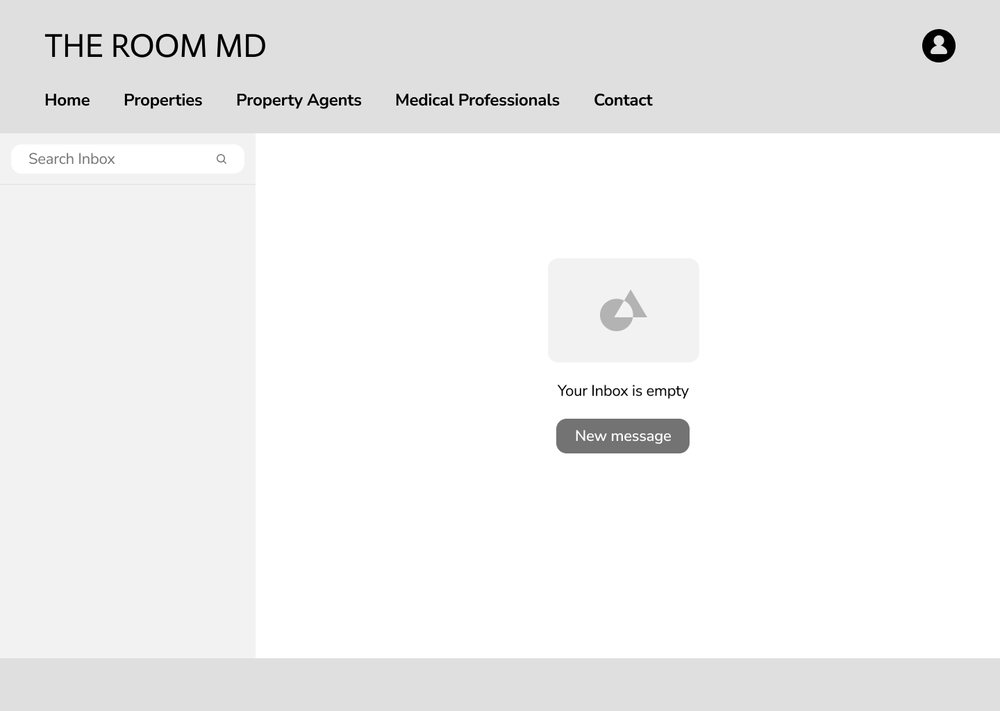
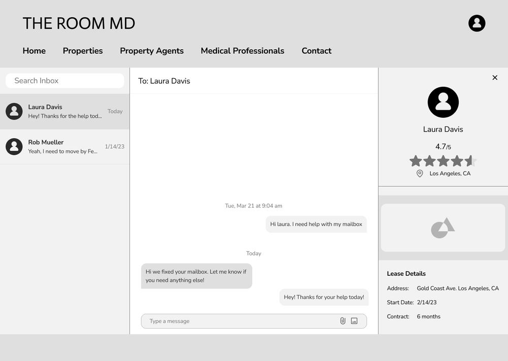
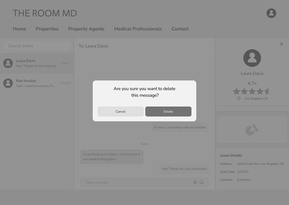
The ability to communicate with the landlord through direct messages was created to fulfill the need for easier and quicker communication.
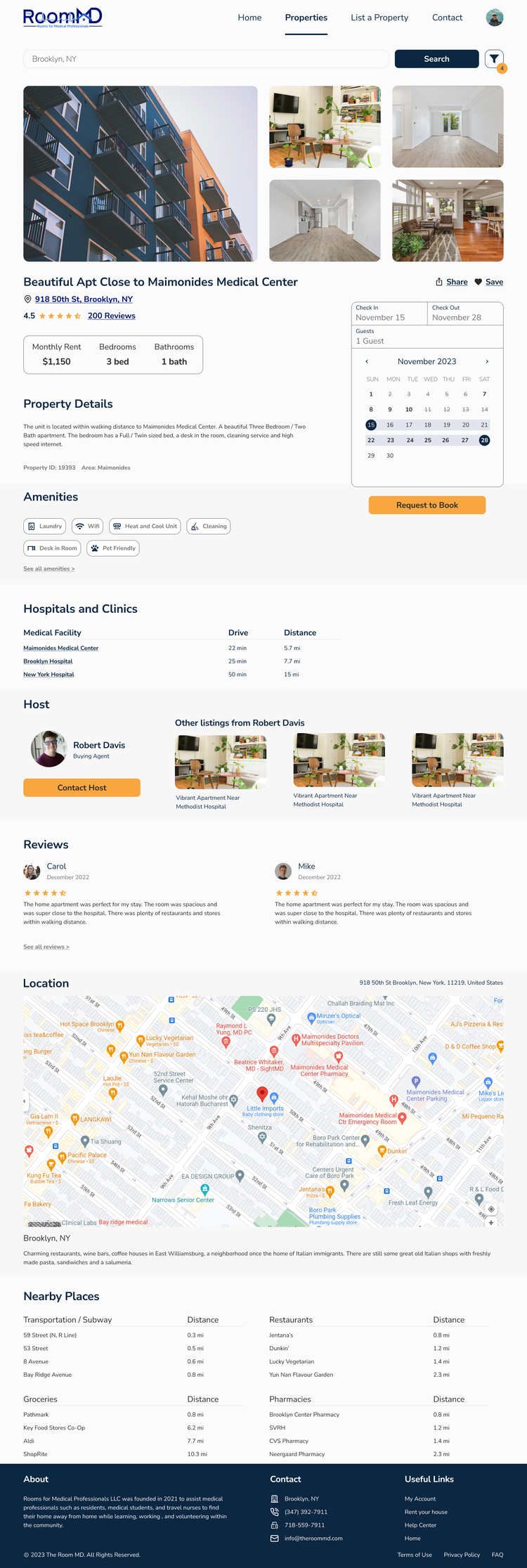
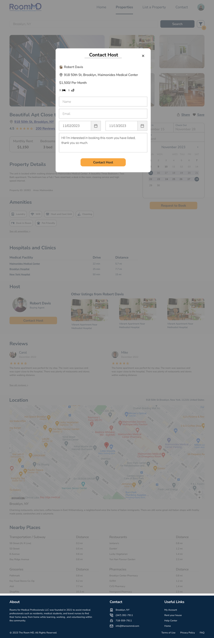
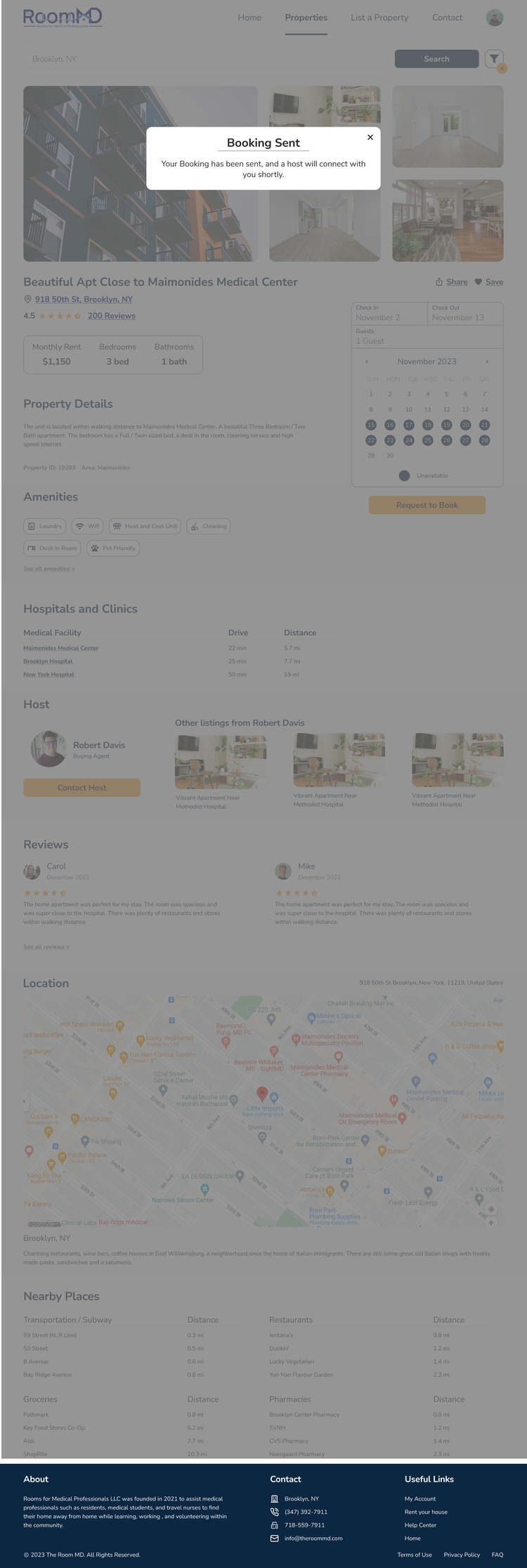
The ability to express interest in a property on the property listing makes the property selection process quick and easy.
Discovery
Kickoff Meeting
During the kick-off meeting, our team of 5 met to review the information we had about the existing website and the desired outcome. We reviewed the project files, including existing client assets, a client call with the project manager, and a project brief with information about the company. The client expressed how they wanted the medical professionals to have the ability to have a personal dashboard, book properties, review properties, and communicate directly with the landlord with a visually appealing and user-friendly interface. At the end of this meeting, I was given responsibility for User Flow 3: Leave a review on a property.
Competitor Research
After the kick-off meeting, I started by looking at their competitor, Rotating Room, and more successful housing websites like Airbnb for inspiration. This helped me pinpoint features that could be integrated into The Room MD designs. I loved the clean and easy-to-use experience Airbnb provides - making it a significant source of inspiration as the project took shape.
The key takeaways:
Icon use is important.
If you want to leave a review, you have to go into "property history".
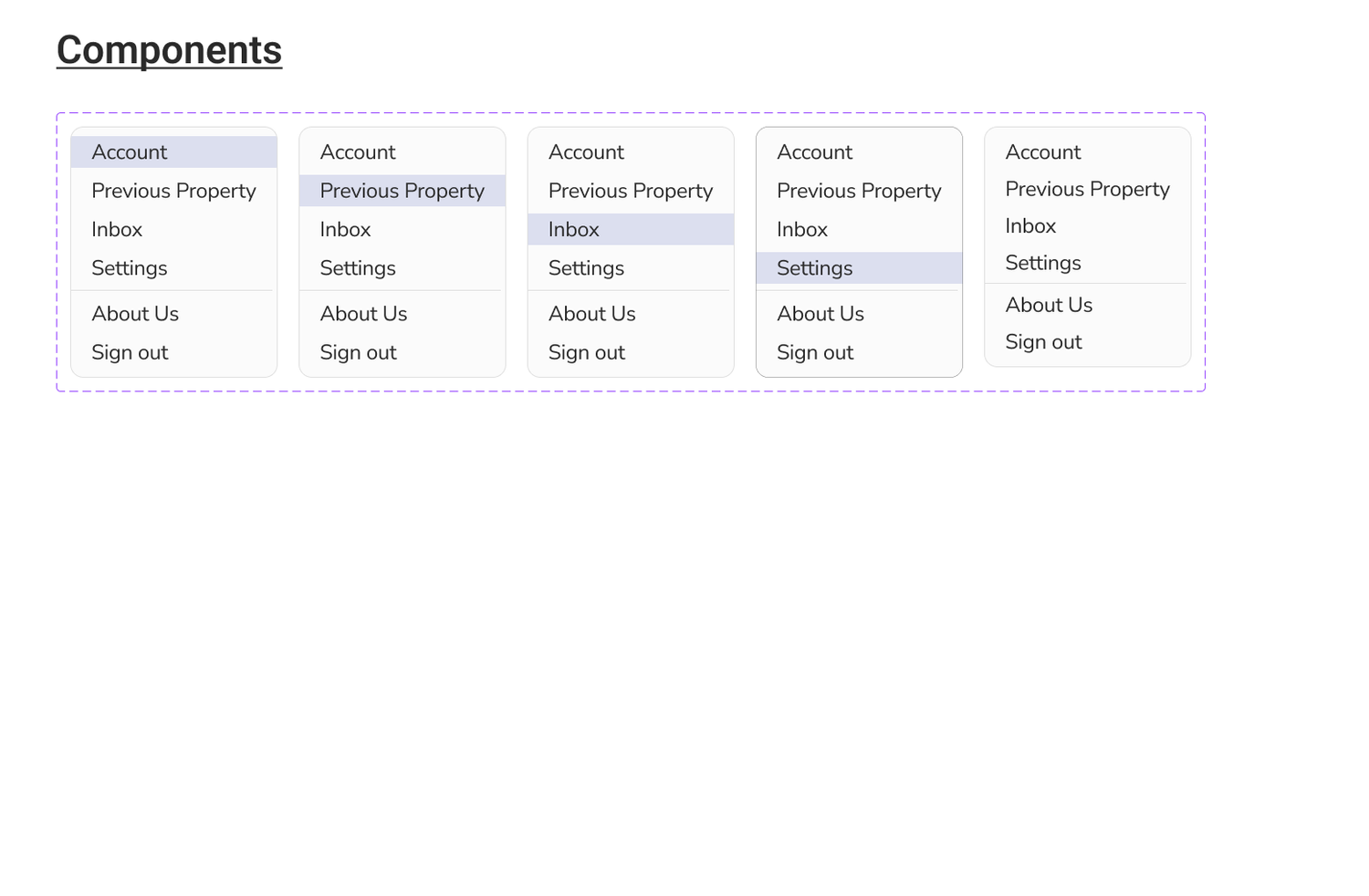
Direct messages, property history, and profile information are all included in a drop-down menu.
User Stories
The client provided us with specific user stories that they wanted us to focus our designs on:
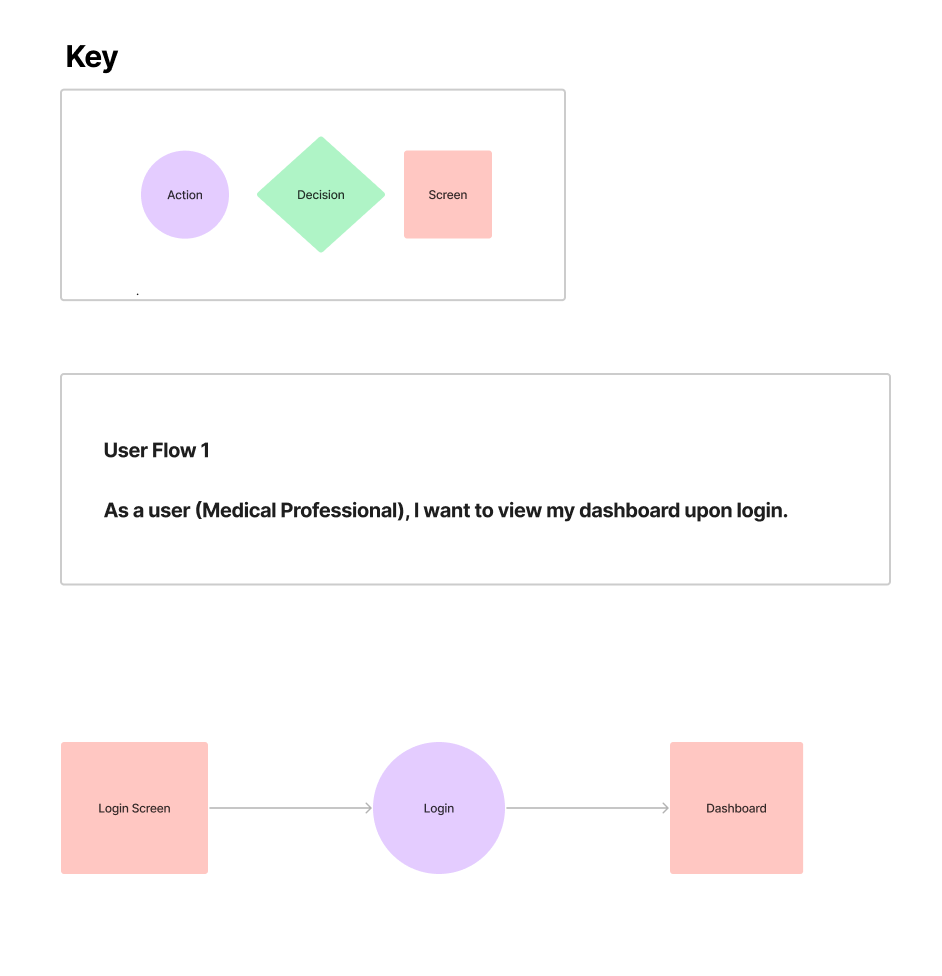
As a user (Medical Professional), I want to view my dashboard upon login.
As a user (Medical Professional), I want to book time for a property.
As a user (Medical Professional), I want to be able to leave a review on a property.
As a user (Medical Professional), I want to be able to communicate with the landlord (send and receive messages.)
As a user (Medical Professional), I want to be able to express interest in a property.
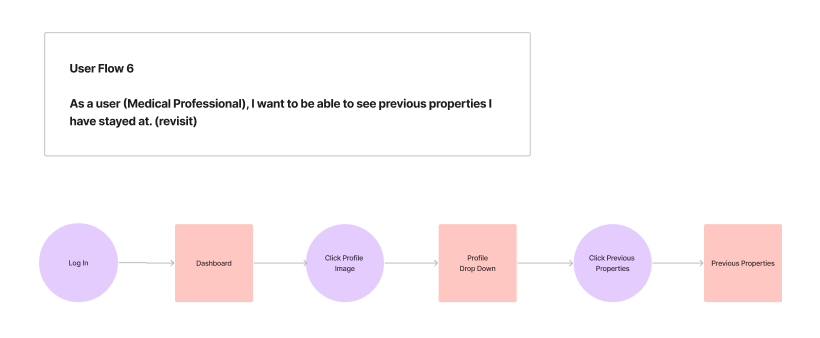
As a user (Medical Professional), I want to be able to see previous properties I have stayed at.
Ideation
User Flows
With the help of our user stories, we developed 6 original user flows. These flows were used to demonstrate how a user can access their dashboard, book time for a property, leave a review, communicate with landlords, express interest in properties, and see the history of past properties previously stayed at. I was given responsibility for User Flow 3: Leave a review on a property.
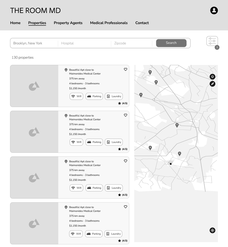
Mid-Fidelity Wireframes
Design
UI Inspiration
When I was looking for inspiration, I went to websites such as Airbnb to see how they designed their review questionnaire. I saw that the designs were intuitive and easy to follow. I wanted my version to look similar but I wanted to add color and iconography based on the brand guide. I also liked how after submitting a review, a thank you message appeared. I decided to implement a thank you pop-up module in my design.
Style Guide
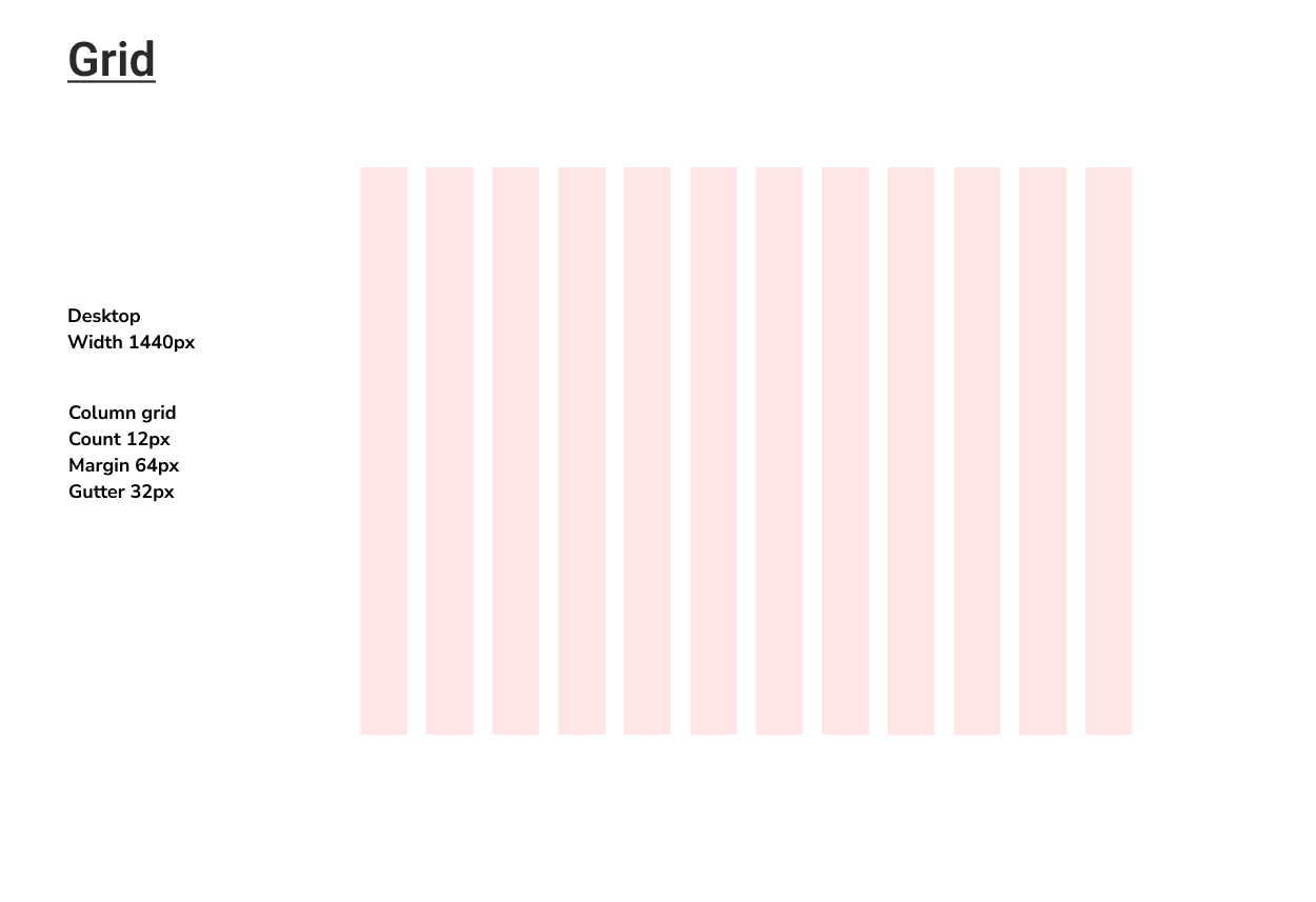
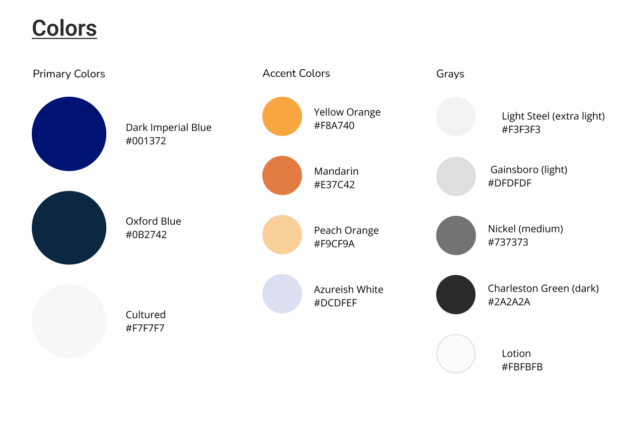
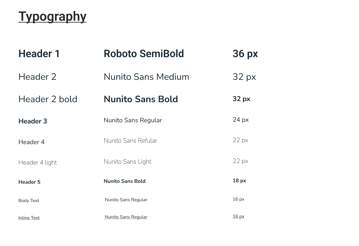
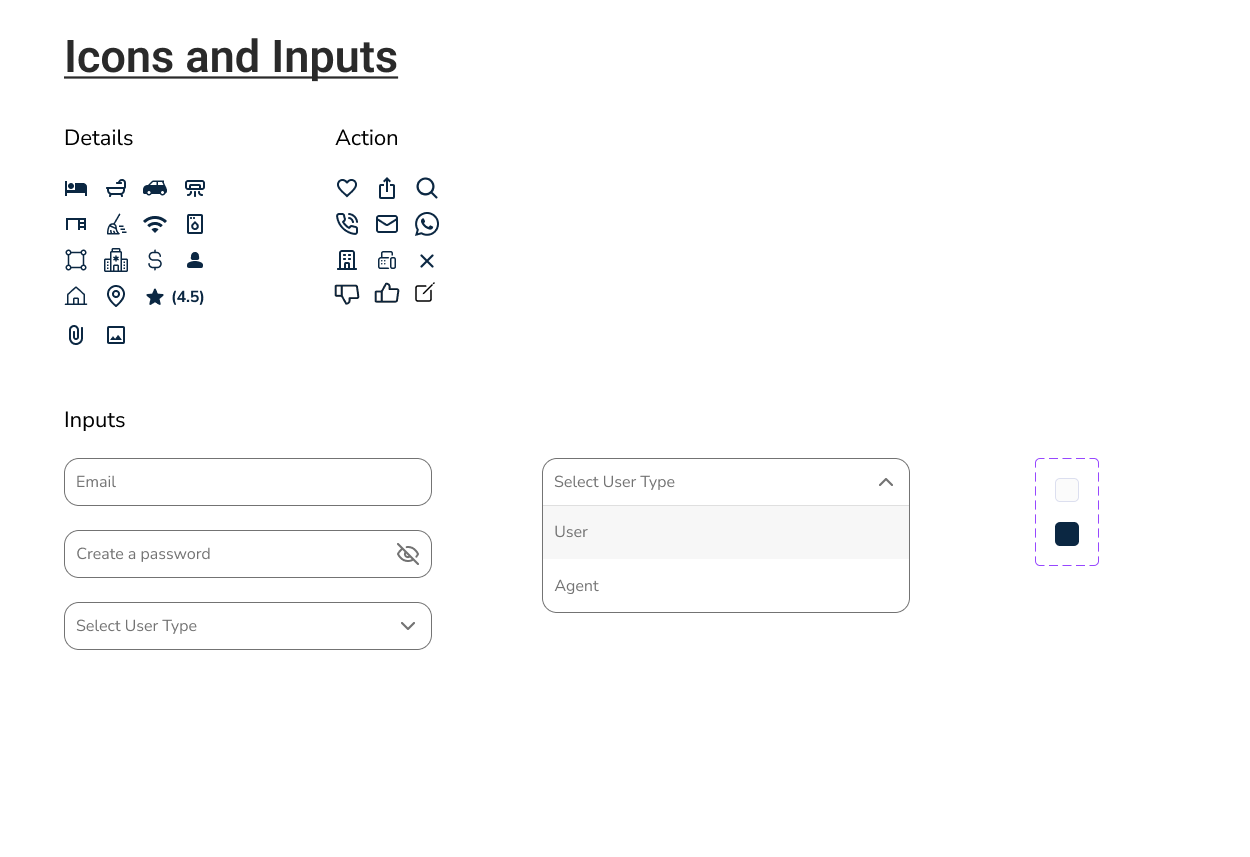
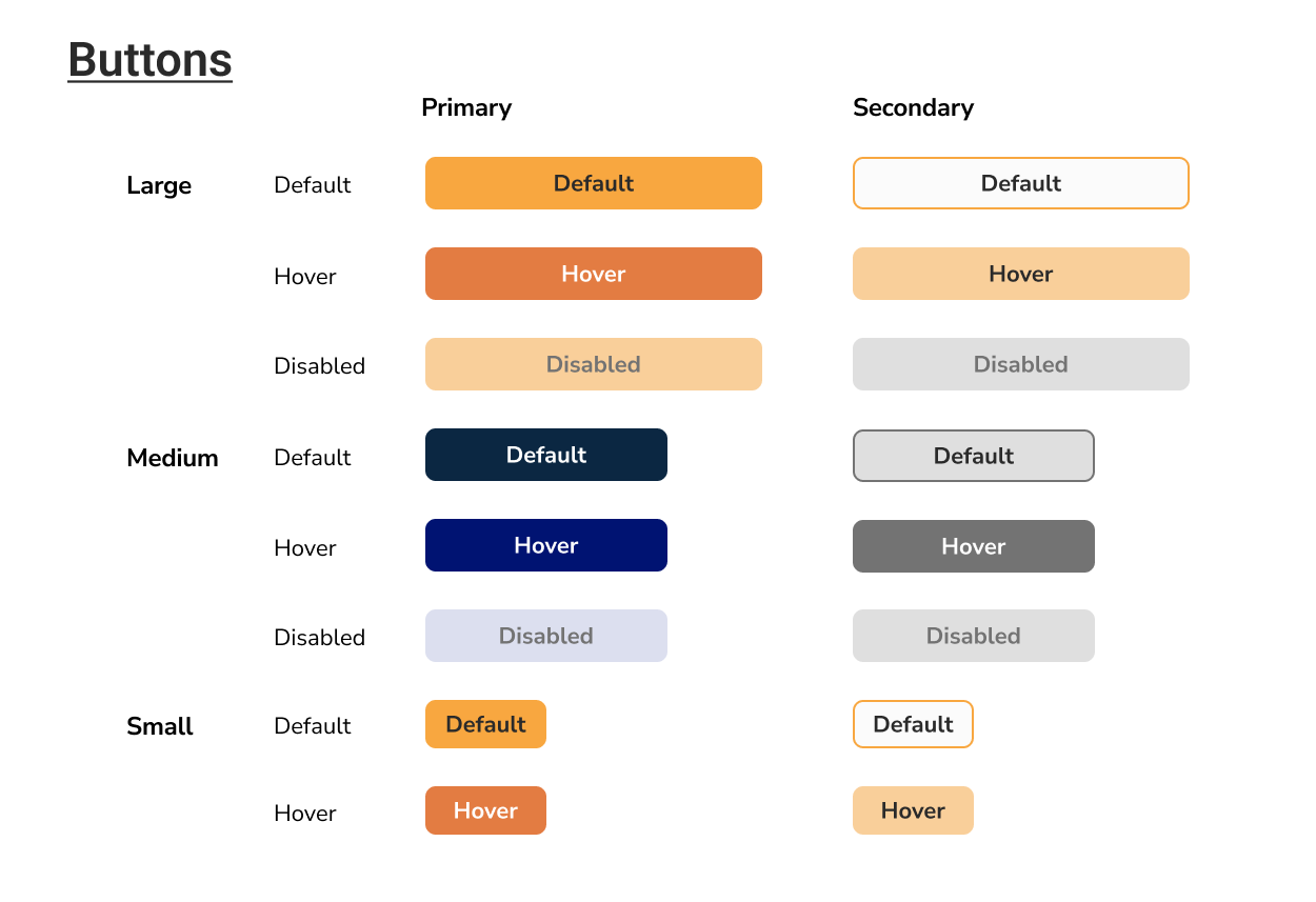
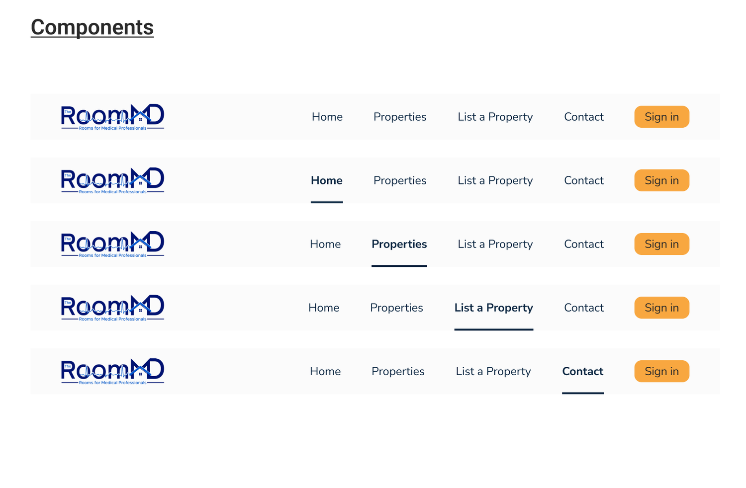
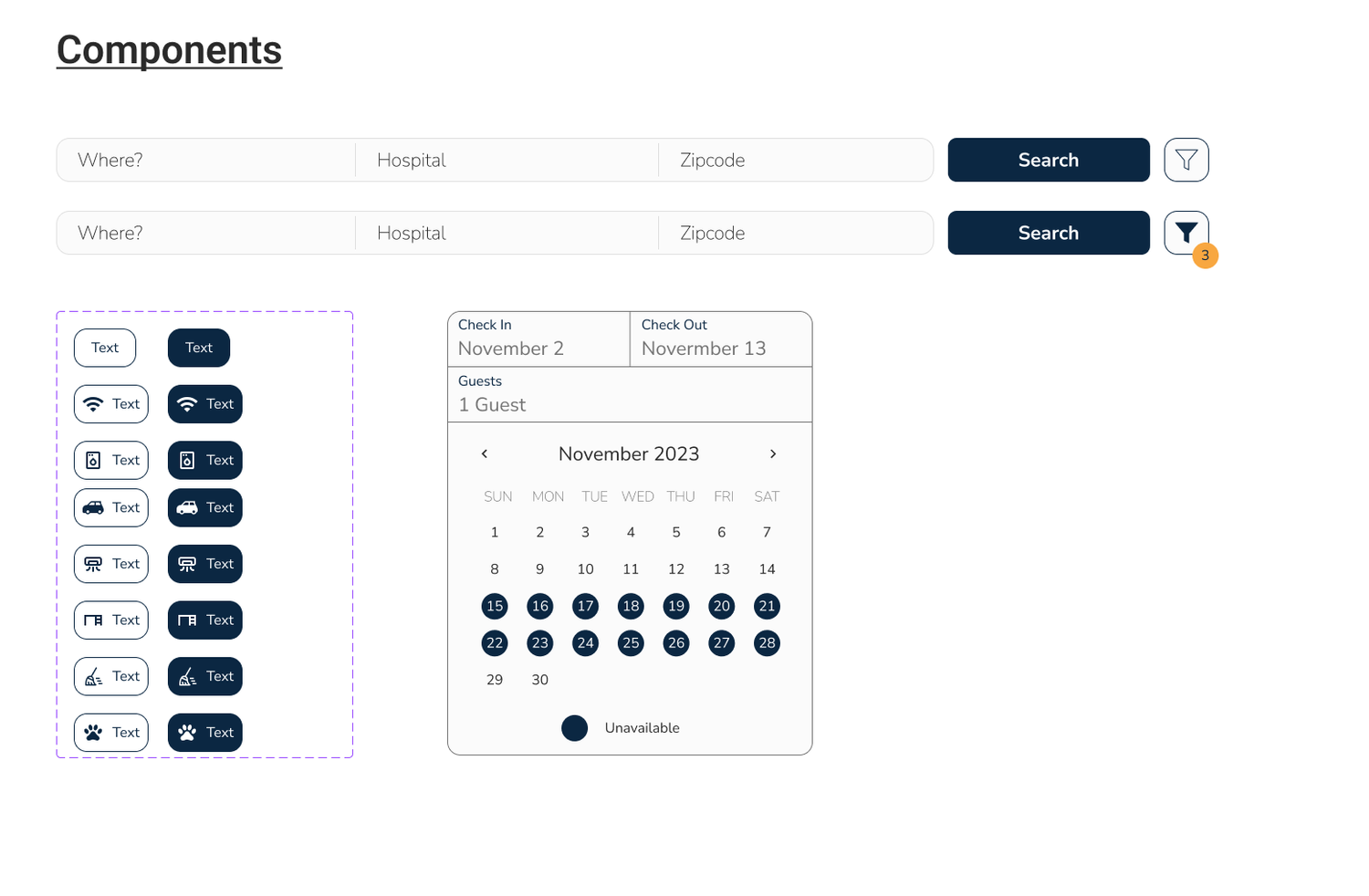
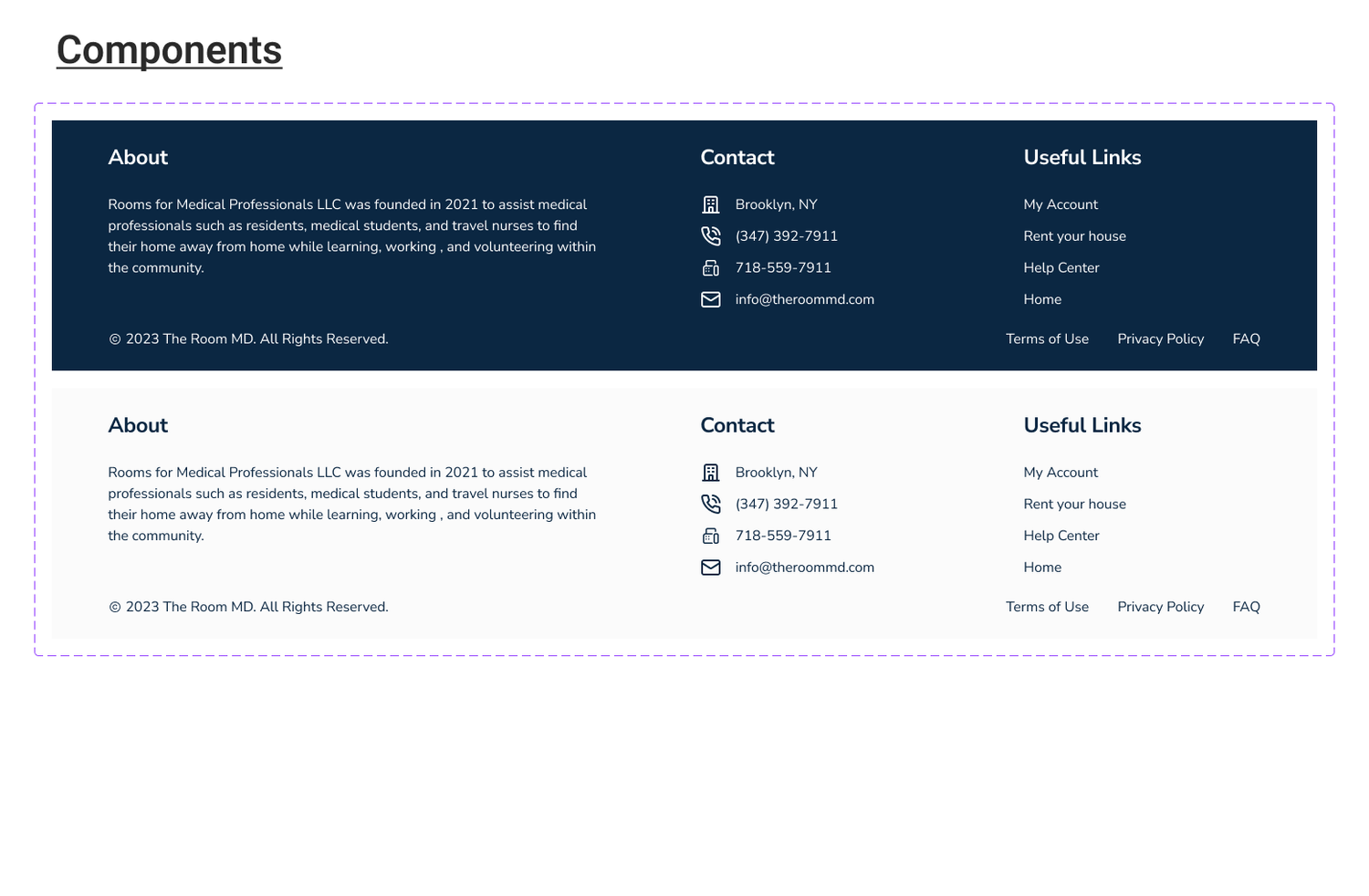
We created the style guide using the client's brand colors and added new colors to enhance the UI. Additionally, we included icons that were necessary for an accessible user experience and components to facilitate easy editing and replacement of important assets by future designers. The team ensured consistency in typography and spacing throughout the design. The style guide was instrumental in creating a consistent design language for branding and was carried forward to our high-fidelity screens
UI Iterations
The team created 3 iterations of the review submissions page and the message systems page for the client to review. We started the process by each creating our iterations, mine was Iteration 1. Then we collaborated and built 3 iterations based on our favorite features we felt worked best for the page. The client chose iteration number 1 due to the use of blue iconography, which stood out more, and the large photo of the host.
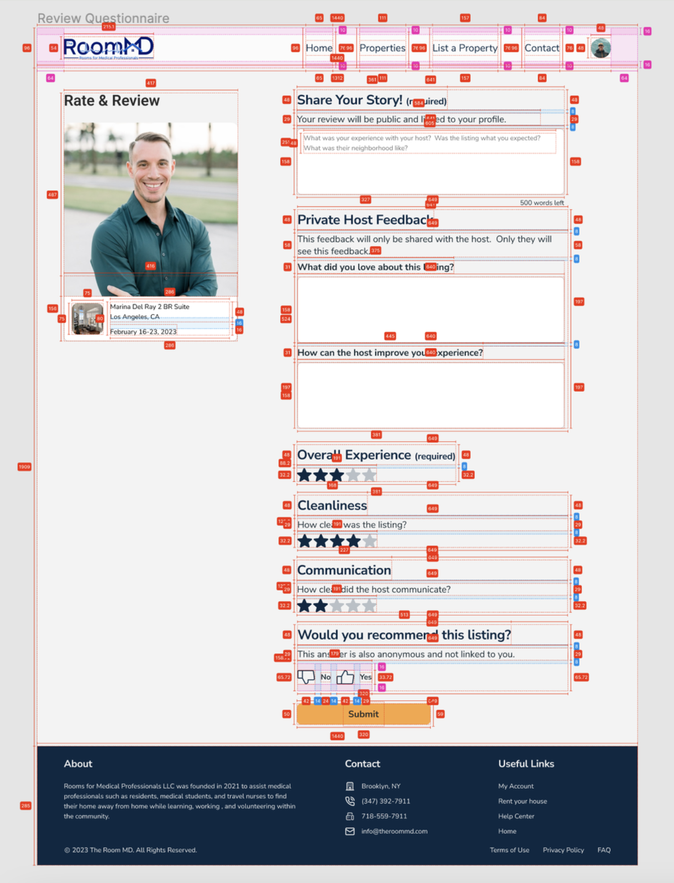
Iteration 1 has a light gray background and dark blue iconography, typography, and footer. The left imagery focuses on the host rather than the property.
Iteration 2 has a lighter background and uses yellow for iconography with a dark blue footer. The left imagery focuses on the property rather than the host.
Iteration 3 has a white background, blue iconography and typography, and a light grey footer. The left imagery focuses on the host rather than the property.
Hi-Fidelity Screens
Using the wireframes, UI direction, and style guide we created, I moved on to designing high-fidelity screens. I ensured that the colors matched the style guide and that all iconography, typography, and pop-up modules were in line with all other designs in style. Because we had such a clear direction with our med-fi screens, the high-fidelity screens were easy to create and define. For the review questionnaire, I prioritized making the design feel intuitive and clear to create an easy-to-follow user experience. I accomplished this by making the questionnaire follow a similar format to other competitive websites and by keeping the designs minimal in copy and icons. Using rating systems that are familiar such as using stars, makes the design intuitive.
Developer Handoff
When it came time to create the handoff for the development team, we made sure to annotate every screen with measurements, arrows, and detailed notes. As a team, we tackled this together making sure all screens were ready for handoff.
Reflection
Undertaking this project has been a challenging but extremely gratifying experience. I was able to work with a team of dedicated designers that allowed me to apply my design skills to create a beautiful product that accomplished the client's goals.
The main challenge I came across was making a design for the submissions page that had both functionality and intuitive design while at the same time making sure it felt modern and on brand. To overcome this challenge, I researched how different submission forms were curated on competitors websites while also sticking to the brand's colors, typography and image treatment. Once I incorporated both the functionality and the design, the submissions page came together easily.
I particularly enjoyed creating high-fidelity mockups for the reviews page and the pop up modules. I was able to create cohesiveness within the design by making the modules a component. Throughout the design process I learned the importance of communication, collaboration and user-centered design. As a team, we worked together to make sure the aesthetics and functionality was balanced to create a useful user experience.
In the future, I would like to focus on making the website more personalized and tailored to the user. Adding things to the dashboard such as the user's name and current property would make the website more refined and unique to the user. Moreover, conducting usability testing would be beneficial in further refining the design, meeting the needs and expectations of the target users.
I am confident that the redesigned website will effectively accomplish the client's goals of housing medical professionals through an easy, stress-free and well designed product.
